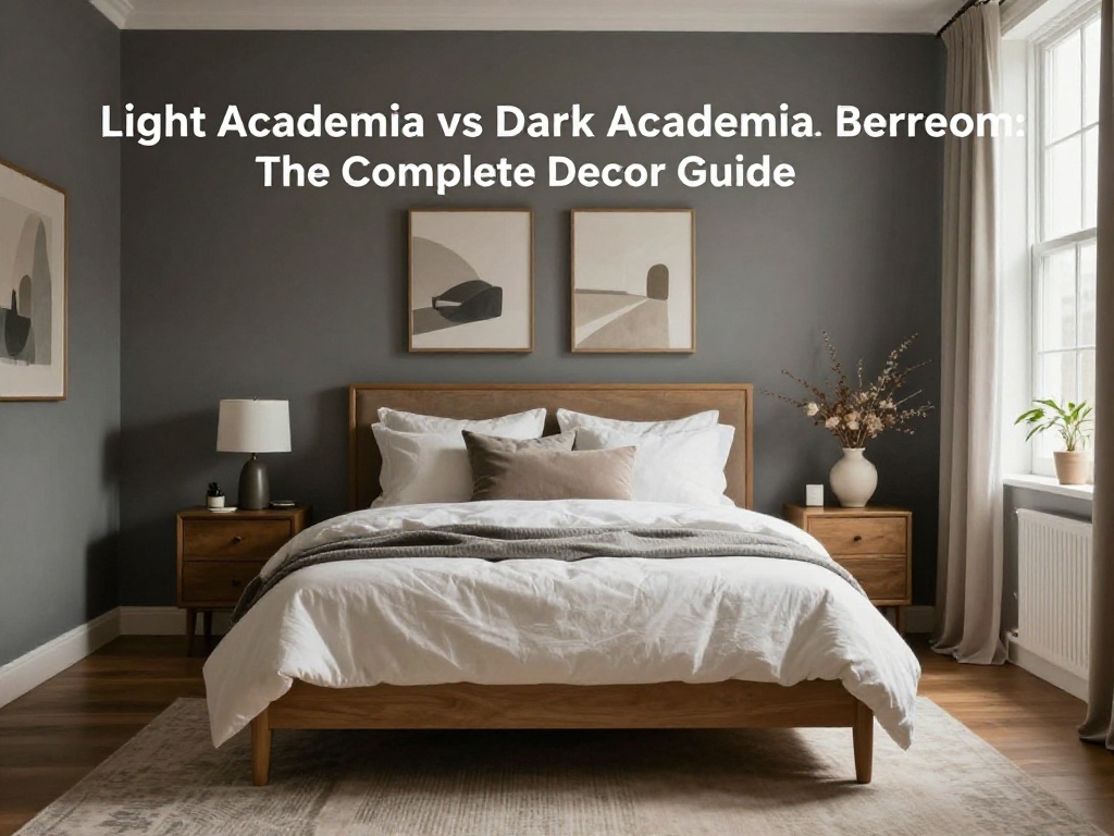
Introduction
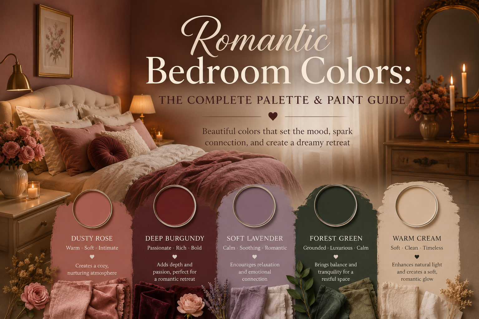
Colour is the first decision in any romantic bedroom — and the most consequential.
Before a single piece of furniture is chosen, before the bedding is layered, before the first candle is lit, the colour of the walls sets the emotional register of the entire space. Get it right and the room has warmth and depth that no amount of styling can replicate. Get it wrong and even the most carefully chosen furniture and accessories will feel slightly off.
The good news is that romantic colours follow a clear and consistent logic. They are warm rather than cool. They have depth rather than brightness. They suggest intimacy rather than openness. And they are almost always slightly muted — slightly dusty, slightly aged, slightly complex — rather than vivid or saturated.
There is something about a muted rose wall that makes a bedroom feel like golden hour all day long. Clay-toned bedding melts into mauve panelling, while soft beige curtains and creamy upholstery keep everything grounded. It feels romantic, but grown up.
This guide covers the complete romantic bedroom colour vocabulary — the specific colours that work, why they work, how to combine them, what paint shades to look for, what to avoid, and how the 2026 colour trends align with the romantic palette. By the end you will have a clear picture of which romantic colour palette suits your specific bedroom and your specific aesthetic direction.
🔗 Ready to style the full romantic bedroom? Read our romantic bedroom ideas guide for furniture, bedding, lighting, and accessories.
The Psychology of Romantic Colours
Understanding why certain colours feel romantic — and others do not — makes every colour decision more confident and more intentional.
Romantic colours work on two psychological mechanisms simultaneously:
Warmth and safety. Colours with warm undertones — reds, pinks, oranges, and warm neutrals — activate a physiological sense of warmth and comfort. They reference firelight, sunset, and the specific quality of light in the evening hours that humans have always associated with rest, intimacy, and safety. Warm neutrals create feelings of cosiness, comfort, and optimism — perfect for the bedroom.
Depth and enclosure. Romantic colours have depth — they are not flat, not transparent, not cold. A room painted in a deep, slightly dusty rose or a rich burgundy feels enclosed and contained in a way that a bright white room does not. This quality of enclosure is psychologically associated with intimacy — the sense of being within something rather than exposed to everything.
The specific quality of romantic colours is what designers call “dustiness” — a slight muting of the colour’s saturation, as though it has been touched by age or by soft light. Consider muted dusty rose tones or blush shades — lighter lavenders can be very soothing and help with relaxation, often linked with luxury, creativity, and spirituality.
This dusty quality is what separates truly romantic colours from colours that are merely pink or merely red. A vivid, highly saturated pink is cheerful and playful. A dusty rose — the same pink with complexity and depth added — is romantic.
You can also read How to Make Your Bedroom Romantic: The Complete Setup Guide for Couples
The 7 Most Romantic Bedroom Colours
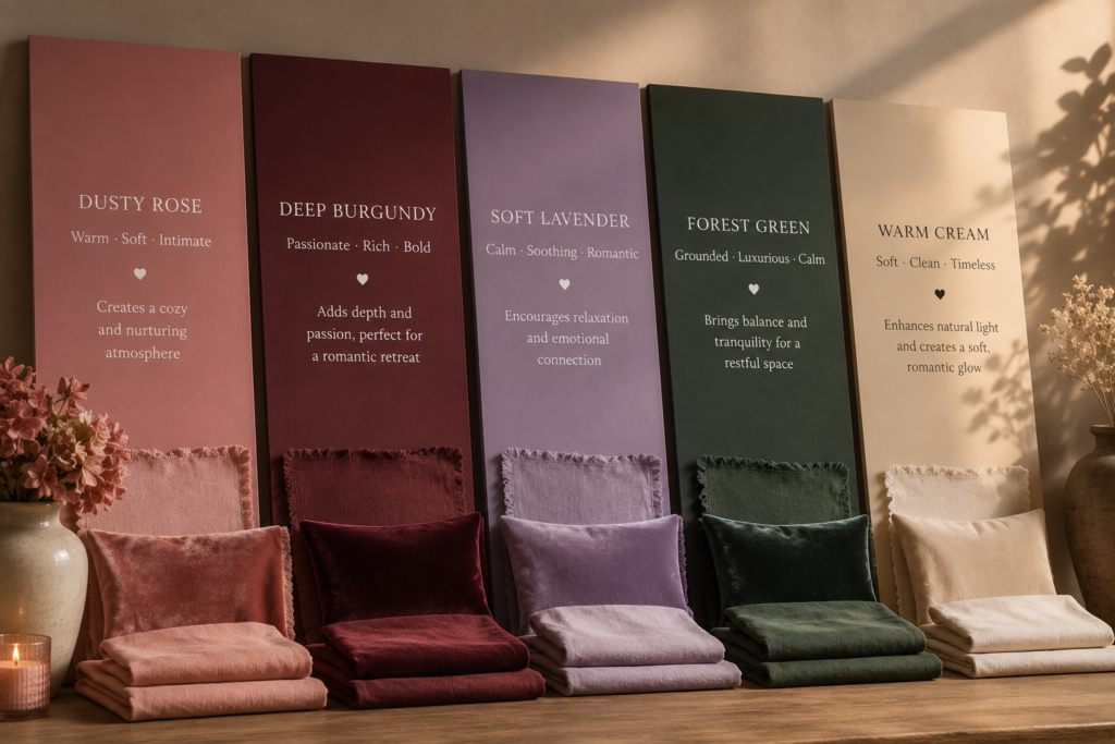
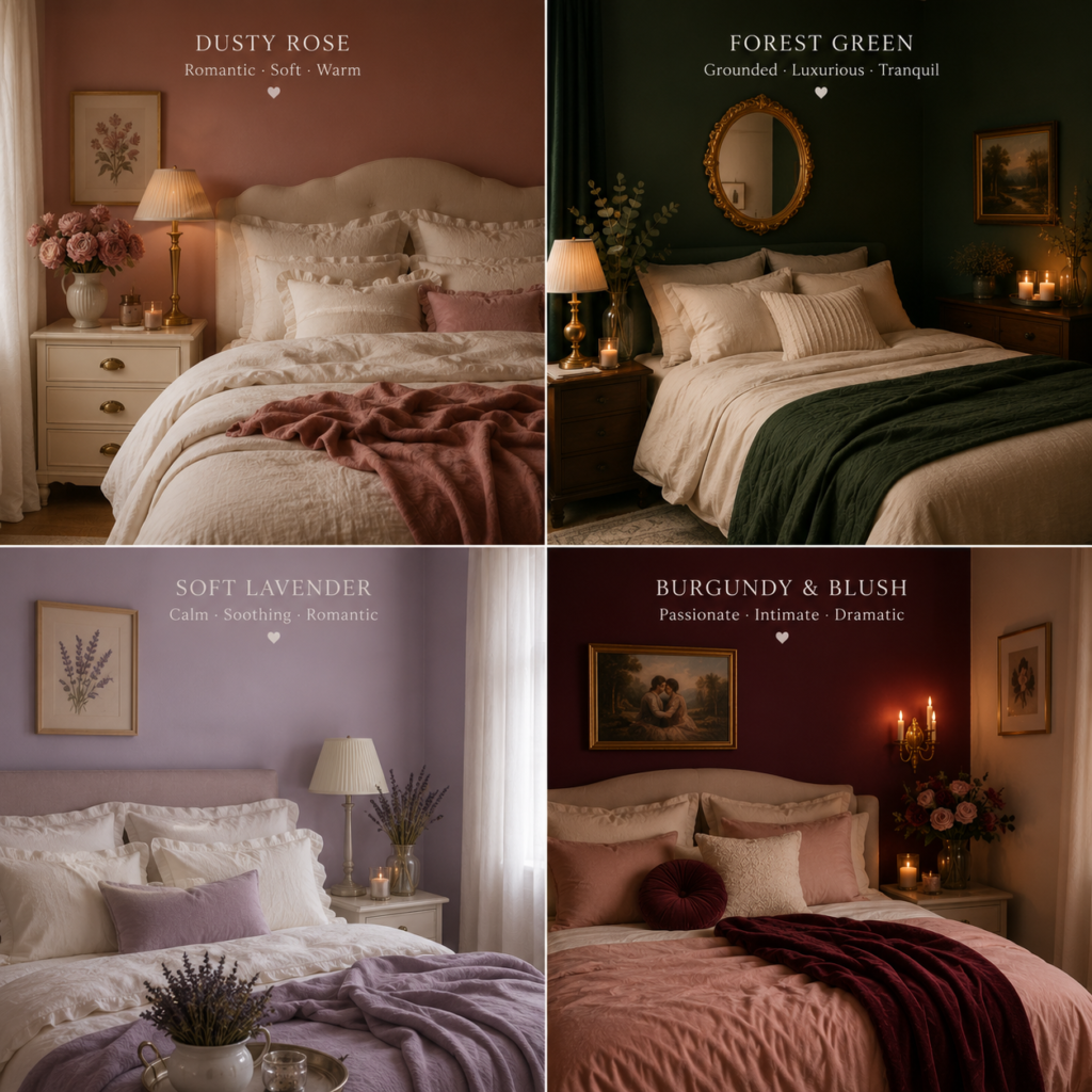
1. Dusty Rose
The most universally romantic bedroom colour and the one with the broadest appeal. Dusty rose is not the vivid pink of a children’s bedroom or the pale blush of a minimalist space — it is the specific warm, slightly grey-toned pink of faded petals, aged velvet, and evening light.
Soft lavender brings a relaxing, gentle quality to bedrooms that feels romantic without being overly sweet — this characteristic applies equally to dusty rose, which achieves a romantic warmth without tipping into saccharine excess.
Why it works: Dusty rose is warm enough to create the sense of enclosure and intimacy that romantic colours require, complex enough to read as sophisticated rather than sweet, and versatile enough to work with cream, gold, sage green, lavender, and deeper jewel tones.
Best for: Soft pastel romantic, coquette romantic, light romantic aesthetics. Works in both south-facing rooms with abundant light and north-facing rooms where it adds warmth.
Paint shades to look for: “Muted Rose,” “Antique Rose,” “Dusky Pink,” “Rose Dust,” “Heritage Rose.” Avoid shades with too much grey (they read as mauve rather than rose) or too much saturation (they read as hot pink rather than dusty rose).
Combinations:
- Dusty rose walls + ivory bedding + aged gold accents = classic romantic
- Dusty rose walls + sage green throws + natural linen = romantic cottagecore
- Dusty rose walls + deep burgundy velvet + brass hardware = rich romantic
2. Deep Burgundy and Wine
The most passionately romantic bedroom colour. Where dusty rose is sweetly romantic, burgundy is deeply romantic — it references dark velvet, candlelight, and the specific emotional intensity of passionate love rather than gentle affection.
Burgundy, especially when teamed with calming teal, adds drama in a refined way to bedrooms, adding sophistication and moodiness. In a romantic bedroom context, pair burgundy with cream and gold rather than teal for the most romantic rather than dramatic effect.
Why it works: Burgundy is one of the deepest warm colours available. It creates an intensely enclosed atmosphere that feels genuinely intimate — a room painted in deep burgundy feels like somewhere private and significant.
Best for: Dark romance, Victorian romantic, passionate romantic aesthetics. Works best in larger rooms with good lamplight — smaller rooms can feel overwhelming without adequate light.
Paint shades to look for: “Claret,” “Deep Garnet,” “Wine Red,” “Burgundy,” “Oxblood,” “Cabernet.” Look for shades with brown or purple undertones rather than pure red — pure red reads as primary colour rather than romantic.
Combinations:
- Deep burgundy walls + cream bedding + gold accents = rich Victorian romance
- Deep burgundy walls + dusty rose accents + dark wood = dark romantic
- Deep burgundy accent wall + ivory walls + blush bedding = balanced rich romance
You can also read Aesthetic Vases Guide: Daisy, Smiley Face, Striped & Rainbow Vases for Every Room
3. Forest Green and Deep Olive
The most sophisticated and the most contemporary romantic bedroom colour. Forest green does not immediately read as “romantic” in the traditional pink-and-rose sense — but it creates an intensely romantic atmosphere through different means: depth, warmth, and the specific quality of being enclosed by something rich and alive.
A dark olive wall sets the stage for creamy bedding, black accents, and soft candlelight. The mirrors and warm lamps add a gentle glow that keeps the space from feeling heavy.
Why it works: Deep green creates the same quality of enclosure and depth as burgundy without its romantic obviousness. Paired with warm lighting, cream textiles, and gold accents, a forest green bedroom has an intensely romantic quality that feels adult and intentional rather than traditionally feminine.
Best for: Modern romantic, dark romance, romantic-gothic, and nature-romantic aesthetics. The romantic colour choice for people who find pink and rose aesthetically unsuitable.
Paint shades to look for: “Forest Green,” “Hunter Green,” “Deep Moss,” “Olive Night,” “Botanical Green,” “Racing Green.” Avoid shades that are too blue-toned (they read as teal rather than forest green) or too yellow-toned (they read as avocado).
Combinations:
- Forest green walls + cream linen bedding + brass accents = sophisticated romance
- Forest green walls + burgundy velvet accents + gold frames = dark romantic
- Deep olive walls + warm terracotta accents + natural linen = earthy romantic
4. Soft Lavender and Deep Plum
Two ends of the purple spectrum, both deeply romantic for different reasons.
Soft lavender is the gentlest and most dreamily romantic of all bedroom colours. Soft lavender brings a relaxing, gentle quality to bedrooms that feels romantic without being overly sweet — it is having a resurgence in 2026 as people move away from stark whites and grays toward colors that actually evoke feeling. Lavender creates an almost meditative romantic atmosphere — calm, slightly otherworldly, and deeply intimate.
Deep plum is the more intense end — deep plum is one of the biggest bedroom paint trends of 2026. It has the depth and richness of burgundy with a cooler, more mysterious quality. In a romantic bedroom context, deep plum works similarly to burgundy but with a slightly more modern aesthetic.
Best for: Soft lavender for dreamy, ethereal, and spiritual romantic aesthetics. Deep plum for rich, intense, and dramatically romantic aesthetics.
Paint shades for lavender: “Lavender Haze,” “Soft Lilac,” “Violet Whisper,” “Dream Lilac,” “Pale Amethyst.”
Paint shades for plum: “Deep Plum,” “Aubergine,” “Royal Purple,” “Dark Orchid,” “Violet Night.”
Combinations (lavender):
- Soft lavender walls + white bedding + silver accents = ethereal romantic
- Soft lavender walls + dusty rose accents + cream = soft layered romantic
- Soft lavender walls + warm gold accents + dried flowers = vintage romantic
Combinations (plum):
- Deep plum walls + cream velvet bedding + gold = rich dramatic romance
- Deep plum accent wall + cream walls + blush accents = balanced deep romance
You can also read Aesthetic Clocks & Desk Accessories: The Complete Guide to Retro Flip Clocks, Daisy Clocks & More
5. Warm Cream and Ivory
The most versatile romantic background colour and the one that makes every other romantic colour work better when used in combination.
Pure white is not romantic. It is too bright, too clinical, and too cold for the warm, intimate atmosphere of a romantic bedroom. Warm cream and ivory — white with warmth added — create a completely different quality. They reflect light warmly, they make coloured accents read more richly, and they have a quality of aged linen and soft morning light that is intrinsically romantic.
Why it works as a primary wall colour: Cream walls allow the romance to come entirely from the textiles, lighting, and accessories — the bedding, the candles, the flowers, the velvet throw. A cream bedroom is never obviously romantic in itself, but it creates the ideal canvas for romantic styling.
Why it works as a secondary colour: In any of the stronger romantic palettes above, cream appears in the bedding, the curtains, and the trim. It is the breathing space that prevents deep colours from feeling oppressive.
Paint shades: “Warm Ivory,” “Antique White,” “Old Lace,” “Cream,” “Soft White,” “Parchment.” Avoid bright white (too cold), cool white (too blue-toned), and pure warm white without any complexity.
6. Warm Terracotta and Clay
The romantic earthy colour — less immediately associated with romance but genuinely romantic in the warmth and depth it creates.
Clay is one of the biggest bedroom paint trends of 2026 — when used in the right combinations, these tones can make a bedroom feel layered, calm, and comfortably lived-in without ever feeling flat. In a romantic bedroom context, warm terracotta and clay create an earthy, sensual warmth — the romance of firelight, of natural materials, of Mediterranean warmth.
Best for: Boho romantic, earthy romantic, Mediterranean romantic. The romantic colour choice for people drawn more to warmth and earthiness than to softness and delicacy.
Combinations:
- Terracotta walls + cream bedding + warm brass = earthy romantic
- Clay walls + dusty rose accents + natural linen = warm layered romantic
- Deep terracotta walls + olive accents + gold = rich Mediterranean romance
You can also read Bunk Room Designs & Dorm Color Schemes: The Complete Aesthetic Guide
7. Midnight Navy and Deep Indigo
The coolest romantic colour — and the most unexpectedly effective for creating a dramatically intimate bedroom atmosphere.
Deep navy creates a cave-like quality — the room feels enclosed, private, and somehow separated from the ordinary world outside. This quality, combined with warm lamplight against a dark background, creates one of the most intense romantic atmospheres available in bedroom design.
Best for: Modern dark romance, sophisticated romantic, and couples who want drama rather than sweetness in their romantic bedroom.
Combinations:
- Midnight navy walls + warm cream bedding + gold accents = dramatic romantic
- Deep navy walls + dusty rose accents + brass lighting = unexpected romantic contrast
- Indigo walls + deep burgundy accents + white bedding = rich jewel-tone romance
The Romantic Colour Palette: 5 Named Combinations
Rather than choosing a single colour, the most effective romantic bedrooms use a colour palette — a group of three to four colours that work together across walls, textiles, furniture, and accessories. Here are five complete named romantic colour palettes:
Palette 1: French Boudoir
Dusty rose + ivory + warm gold + lavender accents The most classically romantic and the most broadly wearable. Works in every size bedroom and every light condition. References the specific warmth of 19th century French interior design.
Best for: Classic romantic, coquette, soft girl aesthetics.
Palette 2: Modern Romance
Warm cream + forest green accents + aged brass + burgundy cushions The most sophisticated and most contemporary romantic palette. Less obviously romantic than the French Boudoir palette but equally effective in practice. Works for people who find the blush-and-rose palette aesthetically unsuitable.
Best for: Modern romantic, adult aesthetic, gender-neutral romantic.
Palette 3: Dark Romance
Deep burgundy or forest green walls + cream bedding + gold accents + candlelight The most dramatically atmospheric romantic palette. Creates an intensely enclosed, intimate quality. Works best in larger rooms with good lamplight.
Best for: Dark romance, Victorian romantic, gothic-adjacent romantic.
Palette 4: Dreamy Lavender
Soft lavender + white + silver accents + dried botanical colour pops The most ethereal and most dreamlike romantic palette. Creates a soft, slightly otherworldly quality. Works beautifully in bedrooms with neutral or warm natural light.
Best for: Dreamy romantic, spiritual romantic, ethereal aesthetic.
Palette 5: Earthy Romance
Warm terracotta + cream + warm brass + olive green accents The most natural and the most grounded romantic palette. References the earthy warmth of firelight and natural materials rather than the delicacy of florals and velvet.
Best for: Boho romantic, Mediterranean romantic, nature-romantic.
The 2026 Romantic Colour Landscape
The 2026 colour trends align strongly with romantic bedroom design — several of the year’s defining colour directions are specifically romantic in their qualities:
Burgundy is having a significant moment. The burgundy colour trend is continuing in 2026, adding sophistication and moodiness to bedrooms. This is genuinely exciting for romantic bedroom design — burgundy is one of the most intensely romantic colours available and its mainstream trend moment means it is now easier than ever to find furniture, textiles, and accessories in burgundy tones.
Deep plum is emerging strongly. Deep plum is a significant bedroom paint trend for 2026 — joining the richly romantic end of the palette alongside burgundy and forest green.
Warm, dusty tones are replacing cold pastels. Cold, overly bright pastels — especially icy blues or washed-out pinks — will feel dated in 2026. Softer, more atmospheric tones like whisper greens, muted blues, and warm earth hues will replace them, creating spaces that feel restorative and enduring. This trend directly validates the dusty, slightly muted quality of the best romantic bedroom colours — the dusty rose replaces icy pink, the warm cream replaces bright white, the soft sage replaces cool grey.
The quality of warmth is the dominant design value. The 2026 colour palette embraces the balance of grounded warmth and refreshing cool hues — today’s most inspiring spaces are layered, versatile, and thoughtfully curated. Romantic bedrooms embody this value completely.
You can also read 80s Room Aesthetic: How to Nail the Perfect Retro Vibe
What Colours to Avoid in a Romantic Bedroom
Understanding what to avoid is as useful as knowing what works.
Bright white — too clinical, too cold, and too reflective of bright overhead light. The opposite of the warm, soft, slightly dim quality that romantic bedrooms require. Replace with warm cream or ivory.
Cool grey — the dominant neutral of the 2010s, now actively dated in design terms and fundamentally incompatible with romantic warmth. The bedroom paint colours losing popularity in 2026 include bright white, cool gray, and icy blue.
Icy pastels — bright, highly saturated pastels lack the dusty, complex quality that makes pastels romantic. A vivid mint green or a bright baby blue reads as playful rather than romantic.
Black — too stark and too contrasting for a genuinely romantic atmosphere. Black accents and details work well within romantic palettes, but black walls create a quality of drama rather than intimacy.
Bright primary colours — red (as opposed to deep burgundy), bright blue, and vivid yellow all lack the depth and muting that romantic colours require. These are energising colours — the opposite of the softening, enclosing quality that romantic design creates.
Applying Romantic Colour in a Renter-Friendly Way
If you cannot paint your walls, the colour of a romantic bedroom can still be achieved through textiles, lighting, and a few key accessories.
A large tapestry or fabric panel in a romantic colour — dusty rose, forest green, or deep burgundy — covering most of a wall creates a near-equivalent effect to painted walls at a fraction of the permanence.
Dark, rich bedding in a romantic colour creates the most important single colour impact in the room regardless of wall colour.
Warm lighting shifts the perceived colour of the entire room — cream and blush soft furnishings under warm candlelight and fairy lights create a warmer, more romantic colour atmosphere than the same items under cool overhead lighting.
Accessories in the romantic palette — cushions, throws, vases, candle holders, and curtains all in the same romantic colour family — build the palette without touching the walls.
You can also use our Free Renovation Tool