Introduction
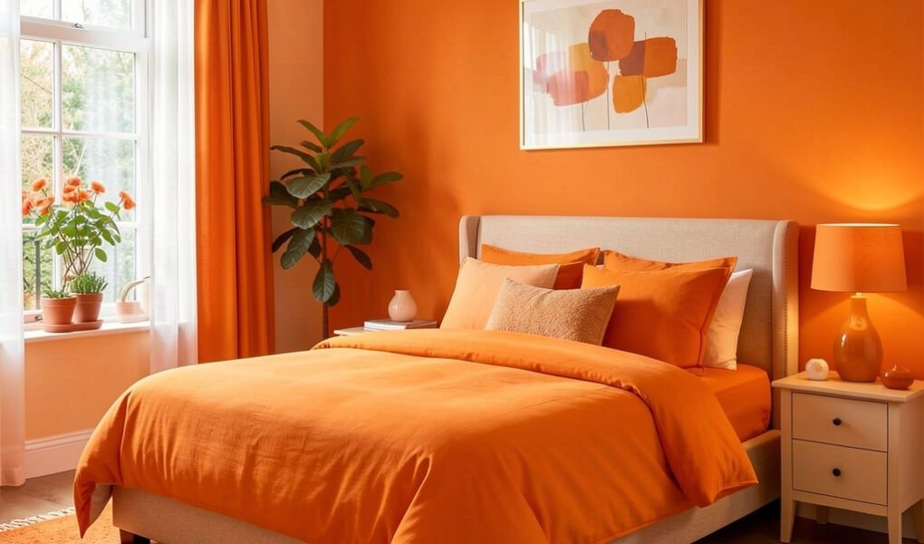
Orange colour bedroom ideas tend to attract two kinds of people: those who already love the colour and want to use it confidently, and those who are genuinely drawn to the warmth of orange but worried about getting it wrong in a room that is supposed to feel restful. Both groups have the same underlying question — which orange, how much of it, and what sits beside it — and the answer to all three starts with understanding that orange is not one colour but a family of very different shades, each suited to a different mood and use.
A bright, saturated burnt orange and a muted, slightly dusty terracotta are both orange by name and practically different design decisions entirely. Getting orange right in a bedroom means choosing the specific shade that matches what the room actually needs — warmth without stimulation, energy without wakefulness, richness without weight — and then pairing it with colours that balance rather than compete with it. This guide covers five key orange shades with their specific uses, five colour pairings with the rationale behind each one, and how to introduce orange at any commitment level from a single cushion to a full room.
🔗 Want to explore colour through a different lens? Read our feng shui home decorating guide for the elemental colour meanings behind orange, red, and earth tones.
Why Orange Works in a Bedroom (Even Though It’s a Restful Room)
It seems counterintuitive at first. Orange is a warm, energising colour, and bedrooms are supposed to be calm. But this apparent contradiction is exactly why orange works so well when used thoughtfully — orange shades are incredibly warm and can help make a room feel more welcoming and relaxing in the evening, while lighter orange tones bring a gentle, motivating energy to mornings, doing double duty across the two very different moods a bedroom needs to support.
The key word is shade. A deep, muted terracotta reads as warm and grounding rather than stimulating — closer to the colour of firelight than the colour of a traffic cone. A soft peach or apricot tone leans gentle and nurturing. A bright, saturated burnt orange is the most energising version of the colour family, and works best used in smaller doses — an accent wall, a few cushions — rather than across every surface in the room.
Understanding this range is the single most important thing standing between an orange bedroom that feels considered and one that feels overwhelming.
You can also read Galactic Room & Galaxy Bedroom Ideas: How to Design a Cosmic Space
The Orange Shade Guide — Which One Is Right for You
Terracotta
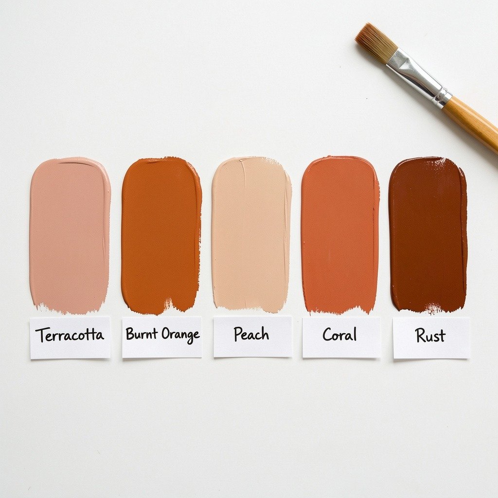
The most popular and most broadly recommended orange shade for bedrooms in 2026. Terracotta sits between orange and brown, carrying genuine warmth without the brightness that makes some oranges feel stimulating. It pairs beautifully with both warm and cool accent colours, which makes it the safest entry point for anyone nervous about committing to orange at all.
Best for: Full-wall application, an entire room, or anyone wanting orange as a quiet backdrop rather than a loud statement.
Burnt Orange
A deeper, more intense, slightly smoky version of the colour — more dramatic and more of a genuine statement than terracotta. Even the most intense oranges won’t pose a real design challenge if balanced correctly; pairing a burnt orange wall with black and white furnishings is a reliable way to keep the look sophisticated rather than overwhelming.
Best for: A single feature or accent wall, particularly in a room with otherwise neutral furnishings.
Peach and Apricot
A much lighter, softer take on orange — closer to a warm neutral than a bold colour statement. A lighter orange like this still brings an illuminating quality that brightens a room without overwhelming it, often with a hint of copper that adds quiet sophistication. This is the easiest orange shade to use generously, including across every wall in the room, since its softness prevents it from ever feeling like too much.
Best for: Nervous first-timers, smaller bedrooms, and anyone wanting the warmth of orange without any visual intensity.
Coral
A pink-leaning orange with a spicy, slightly luxurious quality. Coral shades work particularly well in the bedroom and offer an alternative for anyone who likes the warmth of pink but wants something with a bit more depth and character.
Best for: Bedding, soft furnishings, and smaller accent moments rather than full walls, where its character comes through best.
Rust and Cinnamon
The most autumnal end of the orange spectrum — earthy, spiced, and intense despite being a more muted colour family than burnt orange. These shades pair particularly well with other autumnal tones — deep browns, olive green, warm mustard — for a cohesive, nature-inspired palette.
Best for: A nature-inspired or boho bedroom, paired generously with wood furniture and plants.
You can also read Blush Pink & Rose Bedroom Decor: The Complete Romantic Guide
The Colour Pairing Guide — What to Put Beside Orange
This is the section that determines whether an orange bedroom looks intentional or accidental, and it’s the part most other guides skip past with example photos instead of actual explanation.
Orange and Blue
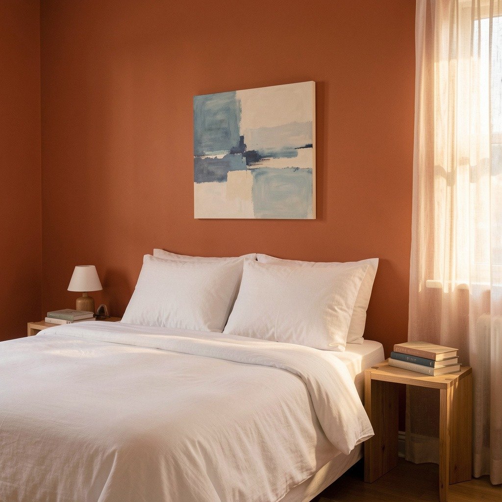
The most striking and most reliably successful orange pairing, because blue and orange sit directly opposite each other on the colour wheel — true complementary colours that intensify and balance each other simultaneously. A terracotta wall paired with a sculptural blue headboard and graphic artwork creates a palette that feels modern and slightly artistic, and the contrast works best with restraint: clean white bedding and minimal furniture let the two colours do the talking without the room becoming visually noisy.
Best ratio: Orange as the dominant wall colour, blue used in one or two strong moments (a headboard, an artwork, a single chair) rather than spread evenly throughout.
Orange and Brown
The most grounded and most universally easy pairing, since both colours sit on the same warm side of the colour wheel. Orange and brown together read as earthy, autumnal, and deeply cozy — particularly effective with wood furniture, which essentially is brown, meaning this pairing often requires no additional colour decisions at all beyond the wall and the existing furniture.
Best ratio: Works well at almost any ratio, since the two colours rarely clash — orange walls with brown furniture, or brown walls with orange textiles, both work.
Orange and Green (Olive Specifically)
A nature-inspired palette where olive green walls create a grounding backdrop, while rust and orange pillows or accents bring warmth and energy on top. Together they evoke the colours of a late autumn forest, and orange works particularly well here as an accent rather than the main event — adding life without overpowering the calm, grounded base that olive green provides.
Best ratio: Green as the dominant wall colour, orange introduced through cushions, throws, and smaller decorative accents.
Orange and White
The cleanest, most restrained, most broadly safe pairing — and often the best choice for anyone trying orange for the first time. Crisp white bedding and simple wood furniture keep an orange wall grounded, letting the colour do all the visual work without the room feeling busy or overwhelming. This pairing also makes the boldest, brightest orange shades far more wearable than they would be against a busier backdrop.
Best ratio: Works at any intensity — pairs equally well with a soft peach wall or a genuinely bold burnt orange statement wall.
Orange and Black
The most dramatic and most contemporary pairing, particularly effective with the more intense end of the orange spectrum. Even the boldest burnt orange becomes sophisticated rather than overwhelming once introduced alongside black and white furnishings, since the dark tone absorbs some of the visual energy the orange creates.
Best ratio: Orange as the wall colour or a large textile moment, black used in furniture, frames, or lighting fixtures rather than as a second wall colour.
You can also read Romantic Bedroom Lighting: The Complete Candles, Fairy Lights & Ambience Guide
Room Application Ideas — From Subtle to Fully Committed
The Single Accent Wall
The lowest-commitment, most universally recommended way to use orange in a bedroom. A single wall — typically the one behind the headboard — painted in your chosen shade, with the remaining walls left in white or a soft neutral. A bright orange accent wall instantly energises a room while a geometric rug and artwork in echoing tones tie the look together without it spreading any further than intended.
The Whole-Room Commitment
For anyone genuinely confident in the colour, painting every wall in a softer, more muted shade — particularly peach, apricot, or a muted terracotta — creates an immersive, cocooning effect rather than a single dramatic statement. This approach works best with lighter, gentler shades specifically, since a fully saturated burnt orange across every surface can tip from energising into genuinely overstimulating in a room meant for rest.
The Textile-Only Approach
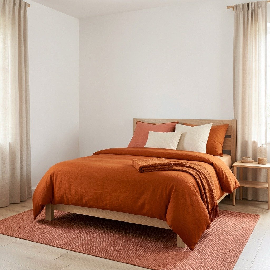
For renters, or anyone not ready to commit to paint at all, orange can be introduced entirely through soft furnishings — a duvet cover, cushions, a throw blanket, a rug — against neutral white or cream walls. This is the easiest version to change or remove later, and it allows experimentation with multiple orange shades simultaneously without any of them needing to commit to an entire wall.
Orange Through Decor and Artwork Only
For the most cautious approach, orange can appear purely through artwork, lighting, and small decorative objects scattered through an otherwise neutral, minimal room. Pops of orange in artwork, lighting, and decor pieces work almost like little sparks of creativity, adding warmth to a room that otherwise leans calm and open — casual, creative, and full of personality without ever requiring a single committed colour decision on the walls themselves.
You can also read Romantic Bedroom Accessories: The Complete Buying Guide
Orange Bedroom Ideas by Bedroom Size
Small bedrooms: A more muted, softer orange (peach, light terracotta) works better across a larger surface area in a small room, since intense saturation can make a small space feel more closed in. Where a bolder, richer shade is wanted, use it on a single feature wall rather than the whole room to create drama without sacrificing the sense of space.
Large bedrooms: A more muted orange suits a larger bedroom with ornate or traditional furniture particularly well, since the size of the room absorbs the colour’s intensity naturally. Larger rooms can also support a bolder, more saturated orange across more wall space without it becoming overwhelming, simply because there’s more neutral floor, ceiling, and furniture to balance it.
Frequently Asked Questions
Q: Is orange a good colour for a bedroom?
A: Yes, when the right shade and amount are chosen deliberately. Orange is a warm colour that can make a bedroom feel more welcoming and cozy in the evening while bringing a gentle, motivating energy in the morning. The key is choosing a shade that matches the mood wanted — a muted terracotta or soft peach reads as calm and grounding, while a bright, saturated orange is more stimulating and works best in smaller doses, such as a single accent wall or a few textiles, rather than across an entire room.
Q: What colours go best with orange in a bedroom?
A: Blue is the most striking pairing, since it sits directly opposite orange on the colour wheel and creates a genuinely complementary, balanced contrast — best used with restraint, in a headboard or artwork rather than spread throughout the room. Brown and orange together create an easy, earthy, cozy palette that works at almost any ratio. White is the safest and most universally flattering pairing, grounding even the boldest orange shades. Olive green paired with orange accents creates a nature-inspired, autumnal feeling.
Q: What shade of orange is best for a small bedroom?
A: Softer, more muted shades — peach, apricot, or a lighter terracotta — generally work better across a larger surface area in a small bedroom, since they bring warmth without the visual intensity that can make a small space feel more enclosed. If a bolder, richer orange is preferred, applying it to a single accent wall rather than the entire room allows the drama of the colour without sacrificing the room’s sense of space.
Q: How do I use orange in my bedroom without it feeling overwhelming?
A: Choose a muted or earthy shade rather than the brightest, most saturated version of orange, and pair it with a calm, neutral colour like white, cream, or brown to ground it. Limiting the orange to one wall, or to textiles like bedding and cushions rather than every surface in the room, also keeps the effect warm and intentional rather than overstimulating. Restraint elsewhere in the room — simple furniture, minimal additional colour — lets the orange feel like a confident choice rather than a chaotic one.
Q: Can orange and pink work together in a bedroom?
A: Yes, particularly when using a pink-leaning orange shade like coral as the bridge between the two. Coral naturally sits between pink and orange on the colour wheel, which means it pairs easily with both blush pink textiles and warmer orange accents in the same room without feeling mismatched. Keeping one of the two colours as the dominant tone and the other as a smaller accent generally produces the most cohesive result.
🔗 Continue exploring colour in your home — read our Chill Room Ideas & Psychedelic Decor and Aesthetic Neon Signs & Fairy Lights: The Complete Bedroom Lighting Guide