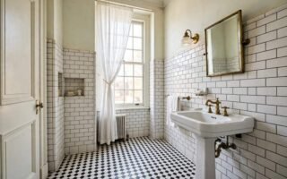
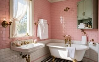
The fastest way to make a bathroom feel retro is colour. Each decade had its own bathroom palette, and knowing which colours belong to which era helps you pick a vintage look that feels intentional, not random. Here are the retro bathroom palettes by decade, from the 1920s to the 1980s, with paint suggestions and tips for using each one today.
Key takeaways
- Each decade had a distinct bathroom palette: white and black in the 1920s, pastel in the 1950s, earth tones in the 1970s.
- Pick one decade as your lead, and use its palette, rather than mixing five decades at once.
- Use vintage colour on one feature, walls, tile or accessories, and keep the rest calm.
- Paint colours vary by brand and by light, so test a sample in your bathroom before you buy a full tin.
- The best retro palette for a small bathroom is a light one: white, cream and one soft vintage accent.
1. How to Use This Palette Guide
Each section below gives the decade’s palette, what it looks like, and how to use it today. The palette chart at the end sums it all up in one place, so you can compare decades at a glance.
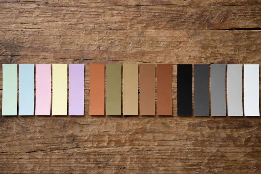
For paint, this guide describes colours in words, soft sage, dusty pink, warm cream, and so on, rather than giving exact brand codes, because paint colours vary by brand and by the light in your bathroom. Take the description to a paint shop, look at the sample cards, and test a sample on your wall before you commit. A colour that looks perfect on a card can look different in a small, windowless bathroom.
For tile, the same rule applies. If you have original vintage tile, match your paint and towels to the tile, rather than trying to change the tile. If you are choosing new tile, pick a vintage pattern, subway, hex or penny, in the decade’s colours, and keep the rest of the room simple.
2. 1920s: White, Black and Nickel
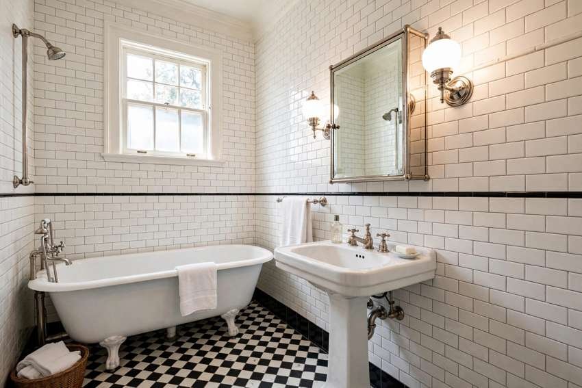
The 1920s bathroom palette is the cleanest retro palette: white subway tile, white fixtures, a black-and-white floor, and nickel fittings. It is elegant, simple, and it suits almost any bathroom today.
Use it today with white subway wall tile, a black-and-white hex or checkerboard floor, a white pedestal sink, and nickel taps. Keep the walls white or very pale grey, and add one classic detail, a simple mirror or a pair of wall lights, rather than a lot of colour. The 1920s palette is the best retro choice if you want a bathroom that feels vintage but still bright and modern.
3. 1930s and 1940s: Soft Colour Arrives
In the 1930s and 1940s, bathrooms began to use soft colour alongside white: pale green, pale blue, soft peach and cream. Fixtures in soft colours, and wall tile in pale tones, made bathrooms feel warmer than the all-white 1920s room.
Use it today with cream walls, a pale green or pale blue accent, white fixtures, and chrome or nickel fittings. A pale green wall tile with white fixtures, or a pale blue towel set with cream walls, gives the 1930s and 1940s feeling without a full renovation. Keep the palette soft and light, so a small bathroom stays bright.
4. 1950s: Pink, Mint and Aqua
The 1950s palette is the most famous retro bathroom palette: pink, mint and aqua fixtures, with white, cream and soft grey around them. It is cheerful, pastel and instantly recognisable as 1950s.
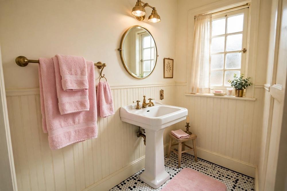
Use it today by matching your paint and towels to your tile, if you have original pastel tile, or by using pastel accessories, towels, a shower curtain, a rug, if you do not. Pink tile pairs with soft white walls, cream towels and chrome fittings. Mint tile pairs with cream walls, white towels and chrome. Aqua tile pairs with white walls, white towels and chrome. One pastel at a time, not all three, is the 1950s rule.
5. 1960s: Bold Colour and Pattern
The 1960s bathroom palette is bolder than the 1950s: bright turquoise, orange, sunny yellow, and bold patterns, often in a single strong colour with white. It is fun and energetic, and it suits a bathroom where you want a strong statement.
Use it today in small doses, because a full 1960s colour scheme can overwhelm a small bathroom. A bold turquoise shower curtain with white walls, a sunny yellow towel set with cream walls, or a single bold patterned wall, with plain tile elsewhere, gives the 1960s feeling without the costume. Keep the rest of the room white or cream, so the bold colour has room to breathe.

6. 1970s: Earth Tones and Warm Wood
The 1970s palette is earthy and warm: avocado green, harvest gold, warm brown, terracotta orange, and warm wood tones. It is the palette of the 1970s bathroom, with coloured fixtures, warm wood vanities, and patterned tile in earth tones.
Use it today by choosing one earth tone as your accent, rather than all of them at once. Avocado green tile pairs with warm wood, cream walls and brass fittings. Harvest gold pairs with cream, warm brown and wood. Terracotta pairs with cream, warm wood and a simple white fixture. A warm wood vanity is the easiest 1970s hero, because it adds the earth tone without changing the tile or the fixtures.
7. 1980s: Pastel, Marble and Brass
The 1980s bathroom palette mixes soft pastels, marble-look surfaces, and brass fittings. It is softer than the 1970s, with dusty pink, soft blue, cream and grey, plus brass and marble-look tile or counters.
Use it today with cream or soft grey walls, a dusty pink or soft blue towel set, brass fittings, and a marble-look counter or tile, if you like it. The 1980s palette is a good choice if you want a retro bathroom that still feels elegant and calm, rather than bold or earthy. Keep the brass to one or two finishes, and keep the pattern simple, so the room feels intentional.
8. Palette Chart: Retro Bathroom Colours at a Glance
Here is the palette chart, one row per decade, so you can compare at a glance.
1920s: white, black, nickel, pale grey. White subway tile, black-and-white floor, white fixtures, nickel taps. Best for a bright, elegant retro bathroom.
1930s to 1940s: cream, pale green, pale blue, soft peach, white. Pale wall tile, cream walls, white fixtures, chrome or nickel. Best for a soft, warm retro bathroom.
1950s: pink, mint, aqua, white, cream, soft grey. Pastel fixtures or accessories, white or cream walls, chrome fittings. Best for a cheerful, classic retro bathroom.
1960s: turquoise, orange, sunny yellow, white. One bold colour, white walls, simple fixtures. Best for a fun, statement retro bathroom, used in small doses.
1970s: avocado green, harvest gold, warm brown, terracotta, warm wood. One earth tone, warm wood vanity, cream walls, brass fittings. Best for a warm, earthy retro bathroom.
1980s: dusty pink, soft blue, cream, grey, brass, marble-look. Soft pastel towels, cream walls, brass fittings, marble-look surfaces. Best for an elegant, calm retro bathroom.
9. Choosing a Palette for Your Bathroom
To choose a palette, start with what you already have. If you have original tile, match your paint and towels to the tile. If you have white fixtures, you can choose any decade’s palette, because white works with all of them. If you have a wooden vanity, an earth-tone 1970s palette will suit it best.
Next, consider light. A small or windowless bathroom suits a light palette best: white, cream and one soft vintage accent. A larger bathroom with a window can handle a bolder palette, such as 1960s turquoise or 1970s avocado, in larger doses.
Finally, test before you commit. Paint a sample on the wall, live with it for a few days in different light, and check it against your tile and towels. A palette that looks perfect on a card can look very different in your bathroom, and a sample is cheap insurance against a full repaint.
What to Avoid
- Do not mix five decades at once. One decade as your lead, and the rest calm, is the retro colour rule.
- Do not use two strong vintage colours at full strength in one small bathroom. One strong colour, and the rest neutral, is balance.
- Do not buy paint without testing a sample in your bathroom light first. Colours vary by brand and by light.
- Do not try to change original vintage tile to fit a new palette. Match your paint and towels to the tile instead.
- Do not mix three metal finishes. Pick one or two, brass, chrome or nickel, and use them consistently.
- Do not use a dark palette in a small, windowless bathroom without good lighting, or the room will feel like a cave.
Costs: Three Retro Colour Budgets
Prices are estimates only and vary by location and product choice. Check current prices before you buy.
Under $100: a new towel set, a shower curtain, and a rug in your chosen decade’s palette. This changes the colour story of the room with no painting or tiling.
Under $400: add paint for the walls, a mirror swap, and a few accessories in the palette. This is where the room starts to look planned in one decade’s colours.
Over $400: add tile work, a vanity change, or a fixture swap in the decade’s palette, with professional help where needed. This is a renovation, and it needs a sample test and a clear plan before you start.
Conclusion
Retro bathroom colour is about choosing one decade and using its palette with care. White and black for the 1920s, soft colour for the 1930s and 1940s, pink, mint and aqua for the 1950s, bold colour for the 1960s, earth tones for the 1970s, and soft pastels with brass for the 1980s. Match your paint and towels to your tile if you have original tile, test a sample in your bathroom light before you buy, and keep the rest of the room calm so your chosen palette can lead. The result is a bathroom that feels vintage on purpose, not by accident.
FAQs
What are the most popular retro bathroom colours?
The most popular retro bathroom colours are white and black from the 1920s, pink, mint and aqua from the 1950s, and avocado green and harvest gold from the 1970s. White and cream work with almost any retro palette, because they let the vintage colour stand out.
How do I choose a retro palette for a small bathroom?
Choose a light palette: white, cream and one soft vintage accent, such as pale green, dusty pink or soft blue. A light palette keeps a small bathroom bright, while a dark or very bold palette can make it feel smaller, especially without a window.
Should I match paint to my original vintage tile?
Yes, if you have original vintage tile. Match your wall paint, towels and accessories to the tile, rather than trying to change the tile. Pink tile pairs with soft white walls, mint with cream, aqua with white, and avocado with cream and warm wood.
What paint colours suit a 1950s bathroom?
Soft white or cream walls suit a 1950s bathroom best, with pink, mint or aqua as the accent, from the tile, the towels or the curtain. One pastel at a time, not all three, is the 1950s rule. Test a sample in your bathroom light before you buy.
Can I mix decades in a retro bathroom?
You can, but keep one decade as the lead and use the others only as small accents. Mixing five decades at full strength looks random, while one lead decade with a few small touches from another era looks intentional.
How do I test a retro paint colour before buying?
Buy a sample pot, paint a large swatch on the wall, and live with it for a few days in different light, morning, evening and artificial light, and check it against your tile and towels. A sample is cheap insurance against a full repaint in the wrong colour.
RELATED READING: