A forest colour palette works when it copies the proportions of the woods, not just the colours. In a real forest, green is layered over a pale sky, warm earth and dark bark, with light doing most of the work. A room should do the same: a pale base, one or two greens as the main accents, warm wood as the counterpoint, and light to keep everything calm. Choose the palette that matches your light, your room size and how you live, and the green will feel restful rather than heavy.
Key takeaways
- Every forest palette needs a pale base, usually cream or soft white, to keep green from closing the room in.
- Deep forest green suits one strong element, such as a sofa or an accent wall, not every wall.
- Moss and sage greens are the easiest forest colours, because they reflect more light and suit small and rented rooms.
- Woodland neutrals, cream, stone, bark brown and warm wood, are what stop a green room feeling cold or flat.
- Autumn forest palettes add rust, gold and terracotta in small amounts, never as a second main colour.
- Misty light palettes suit north-facing and small rooms best, with pale sage, cream and soft grey-green.
- Test every green in daylight and in lamplight, on a large patch, before painting a whole wall.
- Colours are described here in words only, with no brand codes, so you can match them by eye in any paint shop.
1. How a Forest Palette Is Built
A good forest palette has four layers, in roughly the same proportions as a walk in the woods. The base layer is pale and large, usually cream, soft white or very pale sage, and it covers walls and ceilings. The main green layer is medium in size, covering a sofa, bedding, curtains or a rug. The wood layer is warm and smaller, covering furniture, floors and trays. The accent layer is smallest of all, covering cushions, art, plants and one lamp, and it is where a deeper green, a rust tone or a gold tone can appear once.
This proportion matters more than the exact shade. A room with cream walls, a deep green sofa, warm wood furniture and a few moss plants will read as forest, even if the green is not the one in a photo. A room with green walls, a green sofa, green curtains and green bedding, with no pale base, will read as heavy, even if every green is beautiful on its own. If a palette feels wrong, the first fix is usually to add cream, not to change the green.
Light changes green more than any other colour. A deep green that looks rich in a bright, south-facing room can look almost black in a north-facing room in winter. A sage green that looks pale in daylight can look grey under cool white bulbs. Always test a colour on a large piece of card, move it around the room through the day, and look at it under the lamps you actually use in the evening. A small paint chip is not a reliable test, because it hides how a colour behaves at scale.
2. Deep Forest: The Classic, Dramatic Palette
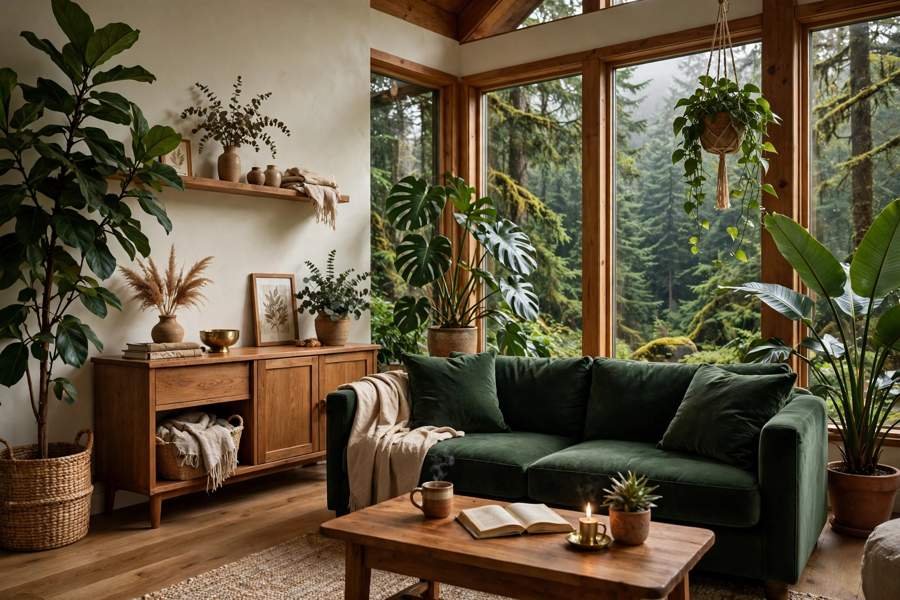
Deep forest is the palette most people picture first: deep green, moss green, cream and warm wood, with bark brown in small amounts. It is dramatic, calm and grown-up, and it suits a living room, a bedroom or a study where you want a sense of shelter. The deep green should be used on one strong element, such as a velvet sofa, a painted accent wall behind a bed, or a set of curtains, while the other walls stay cream.
In a bright room, deep forest can go further. A deep green accent wall, a green sofa and a green rug can work together, as long as the ceiling stays white, the rug has cream in it, and warm lamps keep the room glowing in the evening. In a darker room, keep deep green to the sofa or the bedding only, and let cream, light wood and a mirror do the work of keeping the room bright. A dark green room with no pale counterpoint will feel smaller every evening, however beautiful it looks at noon.
Deep forest pairs best with warm wood, not dark glossy wood. Oak, walnut and rattan all warm the palette, while black furniture can make it feel cold. Brass or warm gold in a lamp, a mirror frame or a tray can add a small glow, but it should appear once or twice, not on every surface. Plants are essential here, because living green softens painted green and stops the room feeling flat. A large monstera, a fern and a trailing pothos will add different greens and leaf shapes that paint alone cannot give.
3. Moss and Sage: The Easiest Forest Palette
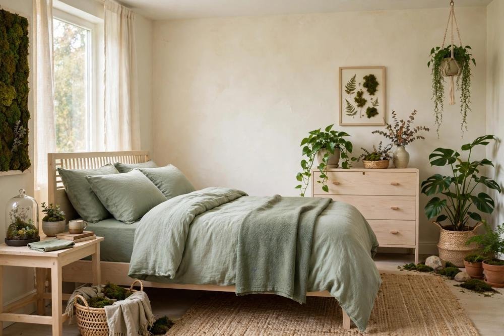
Moss and sage are the most forgiving forest colours, and the best starting point if you are unsure about green. Moss green is a soft, grey-green, like moss on a stone wall, while sage green is paler and greyer, like the underside of a leaf. Both reflect more light than deep forest green, so they suit small rooms, north-facing rooms and rented homes, where a dramatic palette might feel heavy.
A moss and sage palette usually starts with cream walls, then adds sage bedding, sage or moss cushions, a moss throw and plants. It can carry a sage accent wall in a bedroom, because sage is light enough not to close the room in, and it pairs beautifully with pale wood, linen and rattan. In a kitchen, sage cabinets or sage accessories with cream walls and wooden boards give a fresh, woodland feeling without a remodel. In a bathroom, sage towels, a sage plant and cream tiles give the same calm in a small space.
The trap with moss and sage is making the room too pale and too flat. If every surface is sage, cream or pale wood, the room can feel washed out. Add one deeper element, such as a deep green cushion, a dark wooden tray or a large healthy plant, to give the palette depth. Add texture too, because moss and sage rely on texture more than colour contrast: linen, wool, woven baskets and rough wood will keep a pale palette interesting, while smooth, shiny surfaces will make it feel cold.
4. Woodland Neutrals: Cream, Stone, Bark and Warm Wood
Woodland neutrals are the palette underneath every forest scheme, and they deserve attention on their own. Cream, soft white, stone grey, bark brown and warm wood, used together, can make a room feel like a forest clearing even before green is added. This palette suits people who love nature but do not want a green room, or who share a home with someone who finds green too strong.
Start with cream walls and a warm wood floor or warm wood furniture, then add stone grey in a rug or a cushion, bark brown in a leather chair or a wooden tray, and green only through plants. A large plant, a fern and a trailing pothos will give all the green the room needs, without any green paint or green furniture. The room will feel calm, natural and easy to live with, and it will be easy to add a green sofa or green bedding later if you want more colour.
Woodland neutrals also suit open plan homes, because they link rooms without making them identical. The living area can carry cream and wood with plants, the dining area can carry stone and wood, and the kitchen can carry cream, wood and herbs, so the home feels connected. The key is warmth: cream should be warm, not stark white, wood should be warm, not grey or black, and stone should be soft grey, not cold blue-grey. Warm neutrals feel like a forest floor in sunlight, while cold neutrals feel like a warehouse.
5. Autumn Forest: Rust, Gold and Terracotta in Small Doses
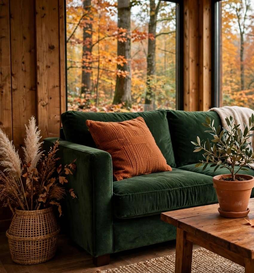
Autumn forest is the warmest forest palette, inspired by autumn leaves rather than summer canopy. It keeps the forest base of cream and warm wood, adds deep green as the main accent, and then adds rust, gold or terracotta in very small amounts, such as one cushion, one throw, one artwork or a terracotta pot. The autumn colours should never compete with green, or the room will feel like a seasonal display rather than a home.
This palette suits a living room or a bedroom in autumn and winter, when warm light and heavy textiles feel right. A deep green sofa with a rust cushion, a gold lamp and a terracotta planter can feel rich and cosy, as long as the walls stay cream and the rug stays light. In summer, the same room can be lightened by swapping the rust cushion for a cream one and moving the terracotta pot to a shelf, so the palette does not feel out of season.
Autumn forest needs restraint with pattern. A leaf print, a check or a plaid can work as one accent, but a leaf duvet, a plaid throw, a floral curtain and a patterned rug together will feel busy. Choose one pattern, keep the rest plain in cream, green or wood, and let the autumn colour be the accent, not the theme. If you love autumn colours, enjoy them in one room, and keep the rest of the home in calmer forest palettes, so the warmth is a treat, not a weight on every room.
6. Misty Light: Pale Greens for Dark and Small Rooms
Misty light is the palette for rooms that need help with light: north-facing rooms, small rooms, basements and rooms with one small window. It uses very pale sage, soft grey-green, cream and pale wood, with almost no deep green at all. The effect is like morning mist in a forest, light, soft and calm, rather than deep and dramatic.
In a misty palette, walls can be pale sage or cream, bedding and cushions can be pale sage and cream, and furniture should be pale wood with visible legs, so light can move through the room. A mirror opposite the window, a light rug and warm lamps will keep the room feeling open, even if the window is small. Plants should be chosen for light green leaves, such as a fern or a pothos, rather than very dark plants that can look black in low light.
Misty light needs warmth to avoid feeling cold. Pale sage with cool white walls and grey furniture can feel clinical, while pale sage with warm cream, pale oak and warm lamps feels like a forest morning. Add one warm element, such as a wooden tray, a rattan basket or a warm gold lamp, to keep the palette human. If the room still feels flat, add one deeper green cushion or one large plant, rather than painting a wall deep green, which would undo the misty effect.

7. Using Palettes Room by Room
Palettes should be chosen by room, light and use, not copied from one room to the next. A living room can carry deep forest, because it is usually the largest and brightest room, and it benefits from a sense of shelter in the evening. A bedroom suits moss and sage, because it should feel restful and light in the morning. A kitchen suits sage and woodland neutrals, because it needs to feel fresh and clean, and deep green can feel heavy near work surfaces. A bathroom suits misty light or moss and sage, because it is usually small and needs light.
In a small home, use one palette as the lead and vary it by room, rather than using a different palette in every room. A home with deep forest in the living room, moss and sage in the bedroom, and woodland neutrals in the kitchen will feel connected, because all three share cream, warm wood and plants. A home with deep forest, autumn rust, bright cottage florals and dark cabin wood in different rooms will feel disconnected, even if each room is beautiful on its own.
Renters should choose palettes that can be carried by textiles and plants, not by paint. A deep forest palette can be got from a green sofa cover, green cushions and plants, a moss palette from sage bedding and cushions, and a misty palette from pale cushions and a light rug. If paint is allowed, test one wall only, in the largest and brightest room, and keep the rest cream. Peel-and-stick wallpaper in a forest colour can work, but only after a test patch and landlord permission where needed, and only on one wall.
8. What to Avoid
Forest palettes fail most often by using too many greens, too much dark, or colours that do not share warmth. Avoid mixing deep green, olive, lime and teal in one room, because they will fight each other even if each is beautiful alone. Choose one green family, deep, moss or sage, and repeat it calmly, with cream and wood as the counterpoints.
Avoid dark on dark. Deep green walls, dark wood furniture, a dark rug and dark curtains together will make a room feel small and gloomy, however expensive the pieces are. If you love dark green, balance it with cream walls, a light rug and warm lamps, and keep dark elements to one strong piece. Avoid cold neutrals with forest green, because stark white, cold grey and black furniture can make green look harsh, while warm cream, soft stone and warm wood make it look calm.
Avoid inventing or copying paint codes from a photo. Colours look different on screen, in a shop and on a wall, and a code that worked in one home may look different in yours because of light, floor and furniture. Describe the colour you want in words, such as deep forest green, soft moss green or pale sage, match it by eye on a large patch in your own room, and test it in daylight and in lamplight before committing. A palette matched by eye in your light will always beat a code copied from the internet.
Conclusion
A forest palette is not a single colour, but a proportion: a pale base, one or two greens, warm wood and light. Deep forest gives drama, moss and sage give ease, woodland neutrals give calm, autumn gives warmth in small doses, and misty light gives brightness to dark and small rooms. Choose by light, room size and how you live, test on a large patch in daylight and in lamplight, and keep dark and patterned elements to one strong piece per room. Done that way, green will feel like a forest you live in, not a colour you are trying to keep up with, and the other guides in this series will help you carry it room by room.
Related reading
- Forest Home Decor: The Complete Guide to Bringing the Woods Indoors
- Forest Themed Bedroom Ideas for Adults
- Forest Kitchen Decor Ideas Without a Remodel
- Forestcore vs Cottagecore vs Cabincore vs Goblincore vs Mushroomcore
- Forest Living Room Ideas for a Calm Woodland Home
Frequently Asked Questions
What is the best forest green for a small room?
Moss green or sage green suits a small room best, because both reflect more light than deep forest green. Keep walls cream, use sage or moss on bedding, cushions or a rug, and add one deeper green plant or cushion for depth. Avoid deep green walls in a small room, unless the room is very bright and the other walls stay cream.
Should forest walls be green or cream?
Cream or soft white works best for most walls, with green used on one accent wall, a sofa or bedding. A green accent wall behind a sofa or a bed can anchor a room, but green on every wall will feel heavy, especially in a small or north-facing room. Test a large patch in daylight and in lamplight before painting a whole wall.
What colours go with moss green?
Cream, soft white, pale wood, stone grey and warm wood go best with moss green. A deeper green plant or cushion can add depth, while rust or gold can appear once as a small accent. Avoid mixing moss green with lime, teal or olive in the same room, because the greens will compete rather than calm each other.
Can I use a forest palette in a rented home without painting?
Yes. Use green cushion covers, a throw, bedding, a rug, plants and wooden accessories to carry the palette, with cream walls already there. A large green artwork or a tall plant can anchor a room like a painted wall, and everything can move with you. Peel-and-stick wallpaper can work on one wall, but only after a test patch and landlord permission where needed.
How do I test a green paint colour properly?
Paint a large patch on card, not a small chip, and move it around the room through the day. Look at it in daylight, in evening lamplight and next to your sofa, rug and wood furniture. If it looks too dark or too grey in any light you actually live in, choose a lighter or warmer green, rather than hoping it will look different on a whole wall.
Is deep forest green too dark for a bedroom?
Not if it is used on one element only, such as bedding, curtains or an accent wall behind the bed, with cream walls, a light rug and warm lamps elsewhere. Deep green on every wall, with dark furniture and dark curtains, will feel heavy and make the room harder to wake up in. Moss or sage suits a bedroom better if the room is small or north-facing.